Optimising Pharmacy Prescription Flow
Objective 🎯

As part of an ideal check exercise, we aimed to optimize our prescription
(RX) flow to increase the conversion rate.
A basic understanding of ideal checkout
To assess how well our pharmacy checkout flow meets user expectations
and,based on observations,to restructure the checkout flow experience
architecturally and visually.
What is RX flow?
When a user purchases any prescribed medicine, they need to upload
a prescription (Rx) before placing the order.
What if a user doesn’t have a prescription?
We allow our users to consult with one of our doctors for free, which we
call e-consult.
The doctor will then prescribe the necessary medicine and provide a
prescription.
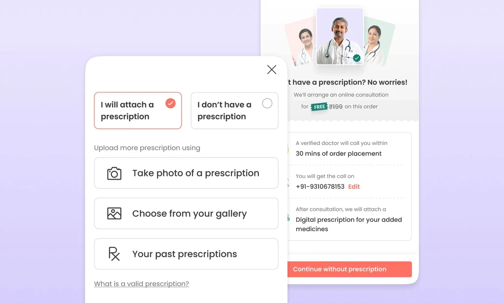
Before proceeding with the problem, let's review how our RX flow page
looks so you can understand the sections we are referring to. 🎯
How We Approached the Problem ?🤔
How We
First, we analysed all available data from the past 15 days.
Here are the key insights the Problem ?🤔
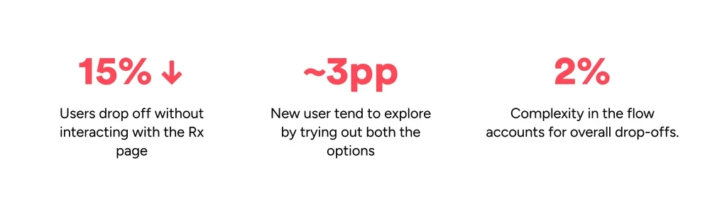
Increasing complexity to capture explicit consent (e.g., introducing an
invoice sub-flow bottom sheet) increases drop-offs.
The interaction pattern of new and repeat users with the Rx page
differs only
marginally
(although the difference increases substantially in subsequent steps).
This drop-off is ~1 percentage point higher for new users compared to
repeat users.
User Segmentation for better understanding

Hypotheses 🤔
The need for a prescription and its impact on orders is not prominently
displayed.Lack of awareness that medicines are Rx and require a
prescription before adding to the cart.
Clarity regarding what a prescription entails is lacking.
Excessive permission requests (e.g., access to gallery) during photo
uploads. Important information such as which medicines require
prescriptions is not upfront.Too much hidden information
Uploading via gallery leads to confusion with files and other
unfamiliar options.The timing for e-consult is unclear.
User interview 👨🏻
For the best viewing experience,
please read this case study
on a laptop or desktop.
Insights
Now that we have data and initial hypotheses, what's next?
We reached out to some users to comprehensively list problems and
UX issues for validation with the data
and to create a holistic view for all 1mg users.
I won't delve deeply into the research but will provide insights into
what we discovered during interviews and
task performance. Based on the tasks, we had specific questions for users.
New RX flow 🆕
After collecting all the insights, we sat together can plotted a new architure for
the RX flow.

Users are not prepared or aware that the medicines they add to the cart are
Rx medicines and that they will need to upload a prescription.
Providing information about both options is overwhelming as users will
choose only one.
Information provided about the options is unclear and insufficient, making it difficult
for users to understand them.
Additional clicks to access important information increase cognitive load.
There's no option to book e-consult when ordering for someone else. Hierarchy in
information provided on the page is lacking.
After user research, we attempted to place orders with different competitors
to see how they address these problems.
From the competitor analysis, we found that Flipkart Health addresses point number
3 to some extent, but we aim to make it even easier for users.
We tried to move all the pages to a bottom sheet. In the past, we learned
that moving a page to a bottom sheet reduces drop-offs (perceived feeling of
reduced steps). We provided clear communication about which medicines require
a prescription and why a prescription is necessary to purchase a medicine.
Providing an entry point for their actions also reduces what needs to be
shown to the user and what doesn't. Previously, users were presented with both options:
uploading a prescription and opting for e-consult. As we observed
from the data, ~3 pp of users try out both options.
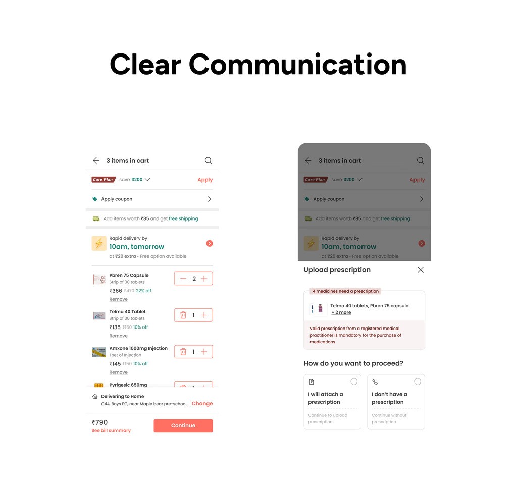

Previously, the upload prescription options were one level deep, which
we brought upfront to establish better context for the user on what to
do here.

We discovered that new users have many queries related to e-consults, mainly about
whether e-consults are free, when they will receive the call,and who will attach their
prescription. We attempted to address allof these issues and simplify them by
using better copy than before.